N0ts Blog
啦啦啦
N0ts
即使前方的路看似绝境,也要有硬生生为自己开辟出一条道路的勇气
我的猪
404 Not Found
如何用一个 div 标签写一个靶子!clip-path 属性的骚操作!
起因
我的小群有个大佬提问
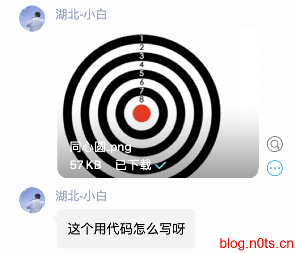
这个用简单的 div 与 css 的确很好实现,但是我突然想到一个不一样的挑战
一个 div 去完成!
思路
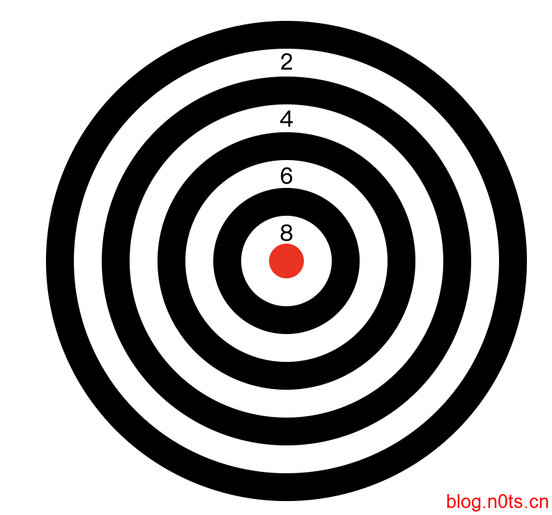
首先中间的圆心加上有规律的黑白边,我第一想到的就是利用 box-shadow 去实现,这个很好实现就不阐述,但是写到中途才发现
然后就是中间的文字,如何表现出来
我首先想到了使用伪元素的 content 去实现文字内容
div::after {
        content: "12345678";
        display: block;
        width: 1rem;
        position: absolute;
        bottom: 22px;
        left: 20%;
        word-wrap: break-word;
        text-align: center;
        line-height: 20.5px;
}
现在文字倒是有了,但是效果却是
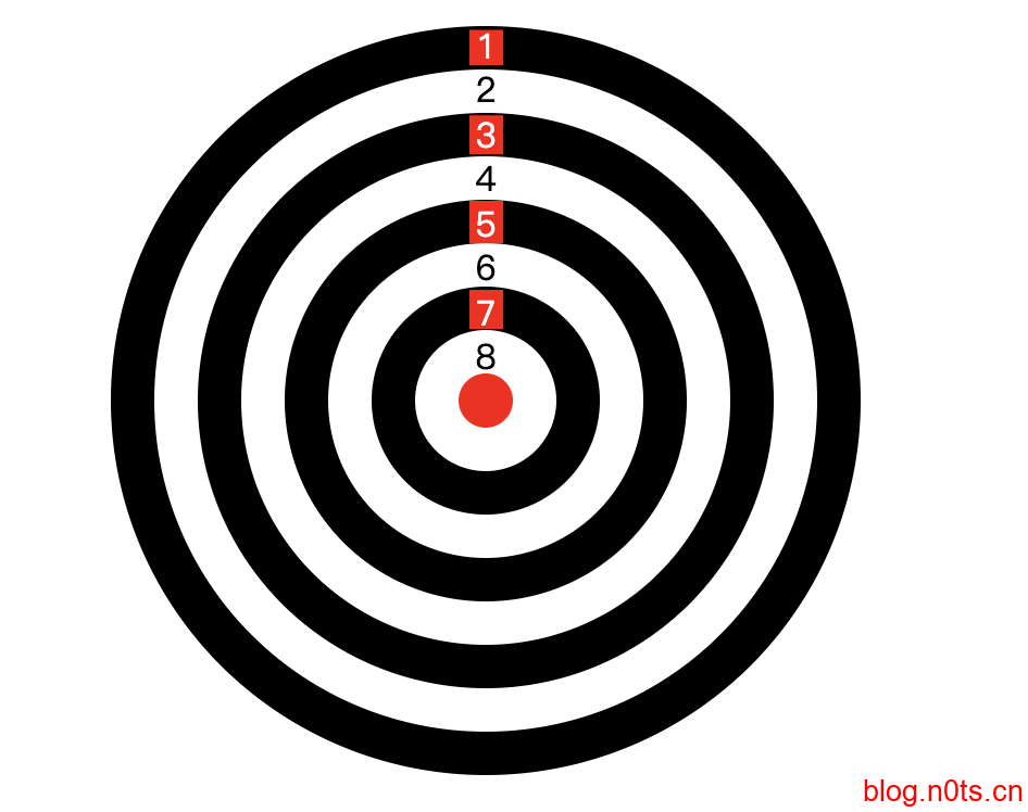
难点就在这,要使在不同的黑白圈中颜色还得不同
我又想到一个解决方案
也就是利用伪元素的 after 与 before 来实现黑白两层文字,并且处于统一位置层叠,接着对上面那层元素使用 clip-path 进行切割
这样的话只需要切割掉相对应的背景,即可让另一边字体展现出来
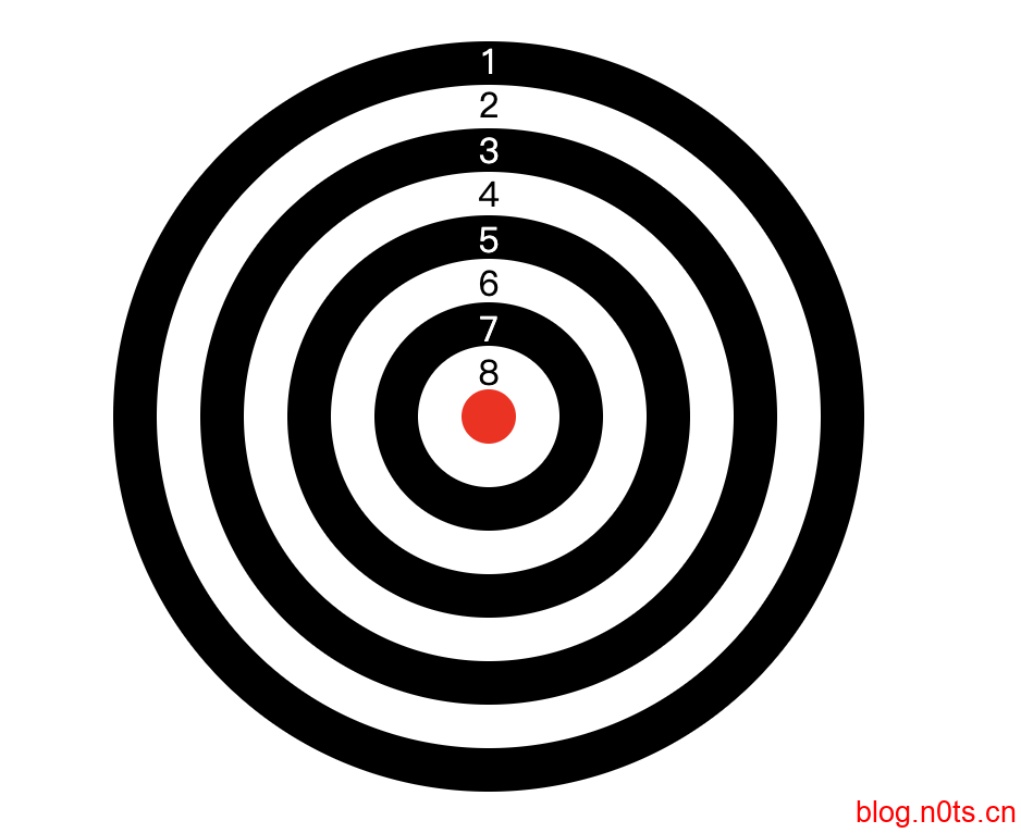
上代码
div::after {
        color: white;
        background: red;
        clip-path: polygon(0 2%, 100% 2%, 100% 12%, 0 12%, 0 26%, 100% 26%, 100% 37%, 0 37%, 0 50%, 100% 50%, 100% 62%, 0 62%, 0 75%, 100% 75%, 100% 86%, 0 86%);
}
去掉红色背景 完成
整个 html 代码
<!--
 * @Author: N0ts
 * @Date: 2021-12-01 23:23:54
 * @LastEditTime: 2021-12-02 00:36:41
 * @Description: 靶子
 * @FilePath: /undefined/Users/n0ts/project/靶子.html
 * @Mail:mail@n0ts.cn
-->
<!DOCTYPE html>
<html lang="en">
    <head>
        <meta charset="UTF-8" />
        <meta http-equiv="X-UA-Compatible" content="IE=edge" />
        <meta name="viewport" content="width=device-width, initial-scale=1.0" />
        <title>Document</title>
        <style>
            * {
                margin: 0;
                padding: 0;
            }

            html,
            body {
                height: 100%;
                display: flex;
                justify-content: center;
                align-items: center;
            }

            div {
                width: 25px;
                height: 25px;
                background: red;
                border-radius: 50%;
                position: relative;
                box-shadow: 0 0 0 20px white, 0 0 0 40px black, 0 0 0 60px white, 0 0 0 80px black, 0 0 0 100px white,
                    0 0 0 120px black, 0 0 0 140px white, 0 0 0 160px black;
            }

            div::after,
            div::before {
                content: "12345678";
                display: block;
                width: 1rem;
                position: absolute;
                bottom: 22px;
                left: 20%;
                word-wrap: break-word;
                text-align: center;
                line-height: 20.5px;
            }

            div::after {
                color: white;
                clip-path: polygon(0 2%, 100% 2%, 100% 12%, 0 12%, 0 26%, 100% 26%, 100% 37%, 0 37%, 0 50%, 100% 50%, 100% 62%, 0 62%, 0 75%, 100% 75%, 100% 86%, 0 86%);
            }

            div::before {
                color: black;
            }
        </style>
    </head>
    <body>
        <div></div>
    </body>
</html>